Well done!
First round finished, as some of you might have noticed is that we moved the deadline to 15:15 UTC today. We got the last “oh my goodness, I can’t even log in” e-Mail 2 minutes before the official deadline ;).
If you have some friends which haven’t taken part today but typically join the Wetterturnier: please tell them they should check their accounts and contact us if they do not work. And maybe not 2 minutes before the deadline :).
Seems that our server responded quickly enough today such that everyone has had enough time to place a bet (who wanted to). However, we are still optimizing and checking what to improve. Your feedback, on the negative but of course also on the positive side of the spectrum is always welcome!
All best by the WT team!
Some hints for the new ones
I’ve just added two new small features. As soon as you are logged in you’ll see your username top right of the page in the black bar. When clicking on it you’ll be forwarded to the user-settings-page. This page now provides two wetterturnier-related options.

Bet-form orientation
This option allows you to set your personal default. The ‘overall default’ is the portrait mode. However, if you prefer the landscape mode simply change and save the setting here. It is still possible to switch the orientation on the front-end by clicking on the “switch orientation” button or by simply pressing “x” once on your keyboard if needed. Available options:
- portrait (which is still the overall default)
- landscape
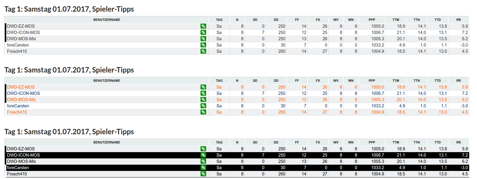
Table styling
Our ww75 once mentioned that the contrast of the tables seems to be relatively low and it will be relatively hard to read the information. There is now an option to change the user-specific default table styling. At the moment three different options are available. The overall default is the same relatively neutral one with a lot of white. However, you can now switch to the two alternative styling’s called “contrast” and “orange-blue” (see below):
- default: the neutral white design
- contrast: brutal contrast (don’t take this too serious!)
- orange-blue: a version similar to the old wetterturnier